University of Texas at Austin

Feature

Connecting the Dots: Visualizing Science

By Joanne Foote

Published Jan. 10, 2025

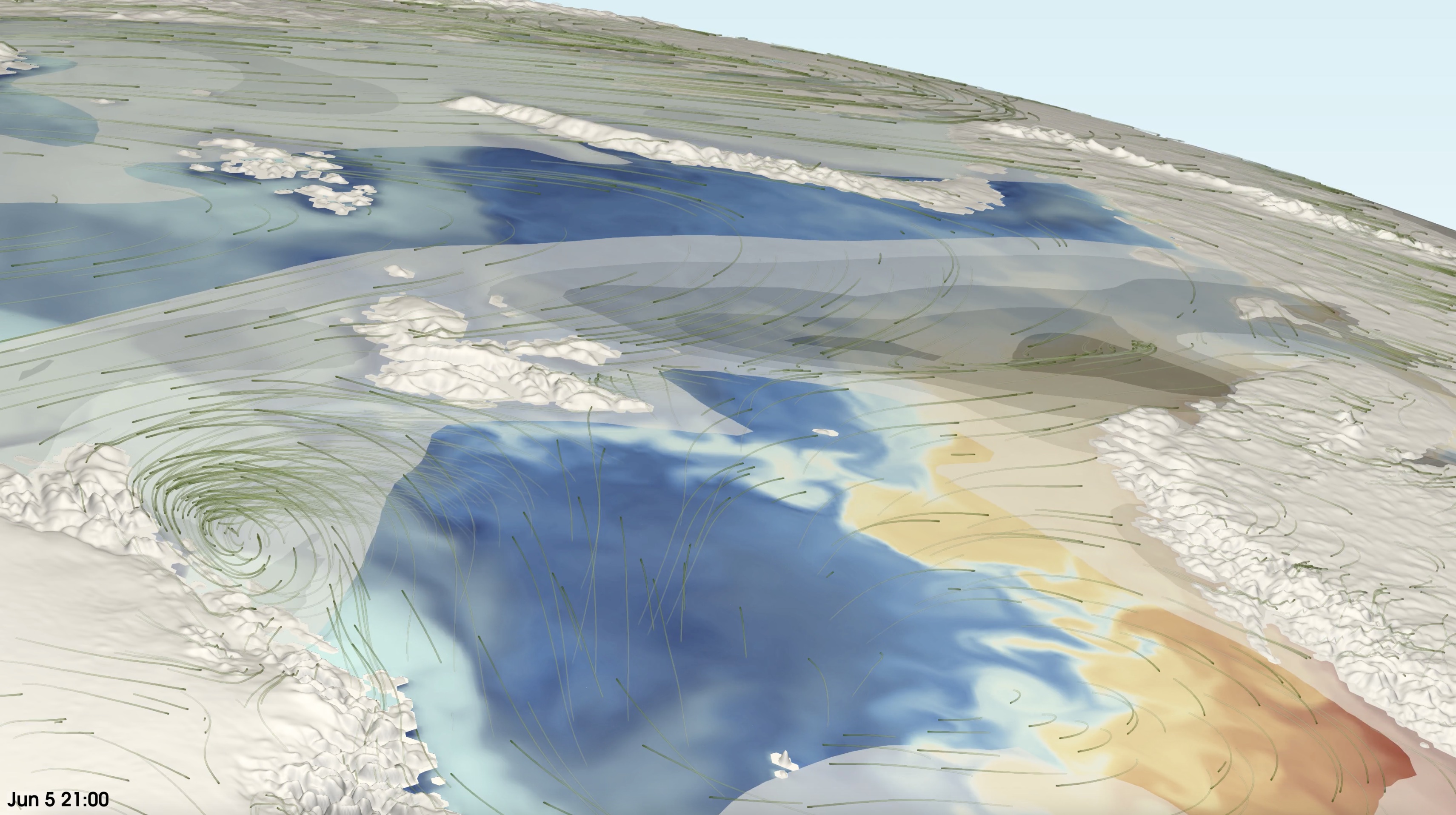
Images from the DOE’s E3SM global climate model showing atmospheric ‘rivers’ carrying moisture from lower latitudes to the very far north arctic. Several relevant model components are shown including wind, ocean temperature and sea-ice coverage.

The human brain processes images in just 13 milliseconds—60,000 times faster than comprehension of the written word. From Leonardo da Vinci’s Mona Lisa to universal symbols, images transcend barriers and bring connection and understanding.

For scientists, visualization provides a window into data representing physical systems that cannot be directly seen to help guide and inform decision-making of complex systems like climate modeling, medicine, and engineering. . 

“Scientific visualization enables scientists the ability to explore their data, compare categories of information and help parse and understand the huge data sets that are a result of computational modeling,“ said Francesca Samsel, a research scientist specializing in visualization with the Texas Advanced Computing Center (TACC) at UT Austin. "One of the best questions a visualization expert can ask a scientist is: In your wildest dreams, what do you want to see in the data that is not visible now?"

“For more than two decades, our visualization experts have collaborated with scientists and translated their data into images, animations, and virtual worlds to communicate complex problems,” said TACC Deputy Director Kelly Gaither. In 2022, Gaither resumed the position as the Director of Visualization, a role she held from 2001-2017.

While most data analysis software programs create visual images of data, researchers often need a more in-depth representation requiring specialized software and computing power using detailed nuances in color, contrast, and shapes to provide a multi-dimensional analysis of research. 
Visualization is an outreach component that conveys research to a wider audience.

— Patrick Heimbach, professor in the Department of Earth and Planetary Sciences

“Think of a pie chart or graph—those are foundational tools to visually explain data. The visual art we create is a sophisticated version of those useful tools,” said Greg Abram, a key member of TACC's visualization team who brings 30 years of experience to his role. “We help visualize things that you can’t physically see—underneath icecaps, back in time to the early universe, up into the air in atmospheric models."

Abram and Samsel's methods have expanded the visual vocabulary beyond prescribed shapes such as a square, tetrahedron, or sphere to organic shapes. They have built a wide variety of lines, shapes, and forms enabling them to construct intuitively encoded data, addressing the growing number of variables and relationships within scientific datasets.

“I bring in their data and find out what the scientist is trying to convey. Francesca meets with the scientist to figure out ways to extend things on a conceptional basis. It’s a great partnership,” he said. “I’m the guy that builds the paintbrush, and Francesca wields the paintbrush.” 

Samsel also reimagined highly saturated color with a focus on nature. “Color is like a symphony," she said. “If a drummer is playing full blast, then you won’t hear the piccolo. Using associative color that coexist harmoniously in nature is logical – the mind and eye can easily digest.”

block.caption

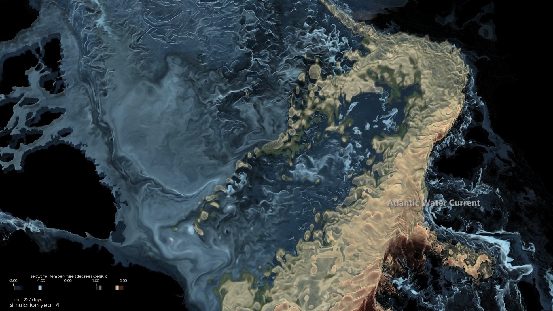
This snapshot illuminates pathways by which profound climate changes spread within the Arctic Ocean and connect with the adjacent ocean basins in one of Earth's remote places. Credit: An Nguyen, Greg Foss, Patrick Heimbach

Patrick Heimbach, lead of the Computational Research in Ice and Oceans Systems Group at the Oden Institute for Computational Engineering and Sciences at UT, says scientific visualization provides a way to make sense of large and complex data sets guided by physical intuition, “but there’s only so much intuition that we have.”

“We see different connections between variables when they are color coded, another variable is overlayed and coded with brightness or with shading and vector plots that are superimposed, and then suddenly we see interactions and connections of covariances that we may not have thought about,” said Heimbach, who is also professor in the Department of Earth and Planetary Sciences at UT.

For example, atmospheric rivers have wreaked havoc in the western United States, but there is now a better understanding due to improved visualization techniques. 

“It’s really visible once you see computational simulations of atmospheric circulation and moisture content—how strong bands of humidity transport elevated quantities of moisture and leads to this phenomenon,” said Heimbach, adding that until recently these could not be seen through computational simulations and visualized in the way they are now.

Heimbach collaborated with his colleague, An Nguyen, and TACC visualization expert Greg Foss to create an animated visualization, “Circulation in the Arctic Ocean,” which illustrated evolution in daily averaged subsurface seawater temperatures from a numerical simulation—it won the 2018 Best Visualization at the annual Supercomputing conference in Denver. “Visualization is an outreach component that conveys research to a wider audience,” added Heimbach.

block.caption

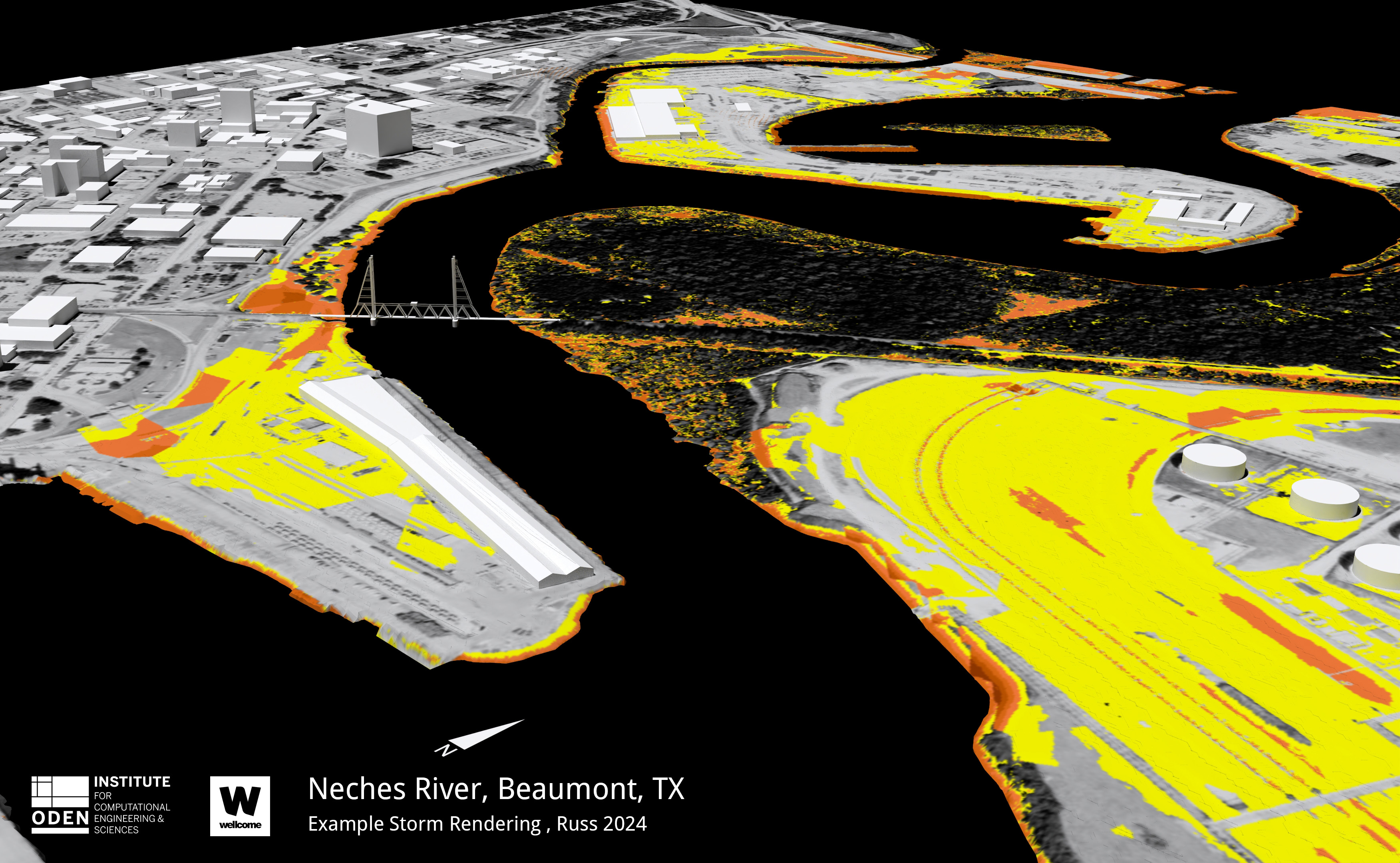
Example visualization of flooding in Beaumont from Hurricane Harvey in 2017. Image credit: Madison Russ

While scientific visualization can resemble a prize-winning work of art, other images can paint a realistic depiction of existing environments, combining data and visual overlays of scientific predictions. 

Madison Russ, a research engineer working with the Computational Hydraulics Group at the Oden Institute led by principal faculty Clint Dawson, is creating visualizations to represent storm surge and coastal flooding. 

“What makes my visualization different is that I use existing data as an underlay—for example, a map of the Texas Gulf Coast. Our goal with the Framework for Disease Modeling research team within Dr. Dawson’s Group is to create a realistic final product to inform the research,” Russ said. Dawson not only leads this research group but is also the Department Chair of Aerospace Engineering and Engineering Mechanics in the Cockrell School of Engineering at UT.

Using ADvanced CIRculation (ADCIRC), a finite element coastal ocean modeling framework combined with computational modeling simulations from Hurricane Harvey, Russ’s illustrations show how coastal flooding is bringing more tropical insects and potentially disease further inland.

The goal of visualization is to translate data into representations that the human brain can easily comprehend, building connections that make science more accessible. Samsel added, “Scientists are grappling with enormous amounts of complex interrelated data and our role is to assist their exploration and communicate their findings to their peers and the public."

“Computational simulations and their accompanying visualizations allow scientists to look ahead to understand and prepare for the future. It’s vital to visualize and understand the very real correlation of things like storm surge and hurricane tracking which can have tremendous human and environmental impacts,” said Abram.

With technologies like artificial intelligence starting to advance science, “visualization will remain crucial to not only communicate science," Gaither concluded, "but it will also be called on to provide transparency and contribute much needed explainability.“